How to create a responsive jQuery carousel
Amazing Carousel is fully responsive which enables you to easily create a jQuery carousel for your mobile friendly website.
The responsive jQuery carousel will resize automatically according to the screen size or the web browser size. You can also specify the number of visible items depending on the screen width.
To create a responsive jQuery carousel, in Amazing Carousel, step 2, goto “Skins” dialog -> “Overview” tab, make sure the option “Support responsive” is selected.
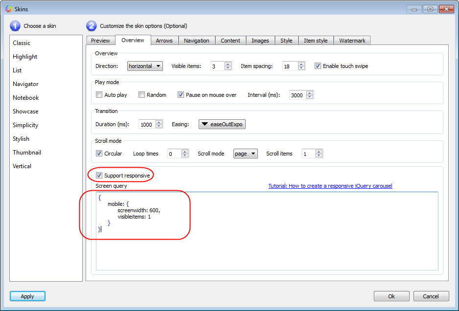
You can also specify the number of visible items depends on the screen width. For example, the default visible items is 3, we want the visible items on a mobile website to be 1, we can enter following codes (which is the default codes) to the “Screen Query” text box:
{
  mobile: {
    screenwidth: 600,
    visibleitems: 1
  }
}
This will force the visibleitems to be 1 when the screen width is less than 600.
We can also add more queries for different screen sizes. For example, the following codes will change visibleitems to 2 when the screen width is less than 800, and change visibleitems to 1 when the screen width is less than 600.
{
  tablet: {
    screenwidth: 800,
    visibleitems: 2
  },
  mobile: {
    screenwidth: 600,
    visibleitems: 1
  }
}
When editing the codes, please make sure the format of your codes is correct, otherwise, it may break the carousel javascript.